
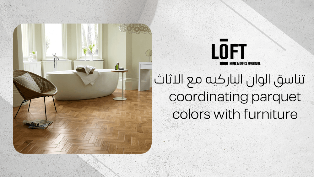
Have you ever walked into a room and instantly felt that something was just off — even though everything seemed perfectly new and stylish? That subtle dissonance often comes from mismatched flooring and furniture tones. Coordinating parquet colors with furniture is not just a decorative choice; it’s the invisible thread that ties a space together, setting the mood and defining its character. When your parquet and furnishings are in harmony, your interiors feel balanced, natural, and effortlessly beautiful.
How do you coordinate parquet and furniture?
Coordinating parquet colors with furniture is all about creating harmony between surfaces, tones, and textures. The parquet color sets the foundation—it shapes how spacious, warm, or modern a room feels. Light-toned options like soft beige, light grey, or natural wood make spaces appear brighter and more flexible when it comes to décor changes. They allow furniture pieces and accents to stand out without overwhelming the eye. On the other hand, rich brown shades such as walnut or oak bring sophistication and depth, especially when paired with furnishings that balance their intensity.
A cohesive design doesn’t stop at floors and furniture. The tones of walls, curtains, and accessories can subtly connect everything together. Adding cushions, throws, or frames in matching or complementary hues can bridge any color gap. Whatever your style, remember to prioritize parquet with lasting quality—something that ages gracefully as tastes evolve.
Why balance matters?
Balance ensures that no single element overpowers the room. When parquet and furniture tones clash or compete, the result can feel cramped or visually noisy. By maintaining equilibrium between light and dark surfaces, you preserve a sense of order and spaciousness that feels inviting rather than overwhelming.
What are key contrast rules?
Understanding contrast helps build a dynamic yet harmonious space, especially when coordinating parquet colors with furniture. It’s not just about mixing light and dark shades, but about guiding the eye, creating visual flow, and defining the room’s character. When parquet tones are thoughtfully balanced with furniture finishes, the space feels intentional, grounded, and visually engaging without losing its sense of harmony.
- Pair light parquet with dark furniture to introduce depth and visual interest.
- Combine medium brown parquet, such as oak or walnut, with lighter furnishings to create an upscale, balanced atmosphere.
- Use neutral tones like beige or light grey for maximum versatility across different furniture styles.
- Avoid very dark parquet in small rooms, as it tends to absorb light and make spaces appear smaller.
How does lighting affect color choice?
Lighting can transform how parquet and furniture colors appear. In rooms with limited natural light, lighter floors help bounce illumination around, creating a sense of openness. In contrast, well-lit or large spaces can handle darker parquet tones, which add warmth and grounded elegance. Always observe how sunlight moves through the room before settling on your color scheme—your floor should enhance that natural glow, not compete with it.
What are the basic principles of color matching?
Balanced contrast is all about harmony—allowing each element to stand out without overwhelming the eye, especially when coordinating parquet colors with furniture. When parquet flooring and furniture differ in tone or depth, the space feels visually organized and dynamic. For example, pairing light oak parquet with rich walnut or espresso furniture grounds the room and prevents it from feeling flat, while dark parquet matched with lighter furniture introduces brightness, openness, and a sense of visual balance.
Medium brown tones such as walnut or natural oak strike a perfect middle ground; they add warmth and richness while concealing everyday wear, making them ideal for family homes or areas with heavy foot traffic. Whether the goal is a sleek modern layout or a softer traditional atmosphere, balancing contrast between floor and furniture tones ensures rhythm and visual flow across the room.
What is the role of light and space?
- Lighting affects color perception. Natural sunlight reveals true undertones, while artificial light can cast warmer or cooler hues. Always test color samples under different lighting conditions.
- Neutral palettes are incredibly forgiving. Shades like beige, grey, or natural oak adapt to varied furniture styles and serve as timeless connectors between classic and modern designs.
- Spatial dimensions matter. Deep, dark parquet tones can visually narrow compact rooms, while lighter shades open them up and make them appear more spacious.
- Tone coordination with materials enhances depth. Aligning parquet colors with the textures of metal, wood, or fabric furnishings creates a layered, cohesive look.
Should you match with walls or accessories?
Matching parquet tones with wall and accessory colors ties the entire space together, which is essential when coordinating parquet colors with furniture. For example, light grey parquet pairs beautifully with a black-and-white palette, creating a clean, contemporary atmosphere that feels cohesive and refined. The key is to aim for smooth visual transitions rather than exact color duplication—when coordinating parquet colors with furniture, contrast should feel gradual and harmonious, not sharp or abrupt.
Tip: Before committing, place parquet and paint samples side by side in daylight. This simple step helps you predict how colors will interact and ensures the final result feels balanced, natural, and in tune with the rest of your décor.
How to choose parquet color for different room sizes?
When furnishing smaller or dimly lit rooms, the right parquet shade can instantly transform how spacious they feel. Light tones reflect more light, making the area appear larger and more inviting.
- Light grey parquet brings a subtle, modern touch that enhances brightness while complementing metallic or darker furniture for visual depth.
- Beige parquet adds gentle warmth, harmonizing beautifully with dark or textured materials to create cozy contrast.
- Blonde wood parquet offers a fresh, airy feeling that expands the space, working perfectly with bold furniture accents or metal finishes.
These lighter shades also adapt easily when décor changes, keeping your room feeling balanced and cohesive.
Ideal choices for large rooms?
Spacious areas can comfortably embrace richer, deeper parquet tones, which plays an important role when coordinating parquet colors with furniture. Medium brown woods like walnut or oak work especially well in larger rooms, adding warmth and a subtle sense of luxury without making the space feel heavy. These natural hues age gracefully, conceal minor scratches, and pair beautifully with classic wood or fabric furniture—creating a balanced, timeless setting where parquet and furniture feel naturally connected.
How to adapt for modern decor?
For contemporary or mixed-use rooms, natural wood tones and sandy beige parquet strike the perfect balance between modernity and versatility. These colors serve as a neutral canvas for bold accessories and flexible furniture arrangements. They maintain visual harmony in evolving interiors, ensuring that your parquet stays stylish even as your décor evolves.
What is the effect of Paprika color chairs on parquet floors?
The Paprika shade — that lively red-orange tone — brings warmth and energy to any space. When paired with grey parquet floors, it immediately lifts their cool neutrality, infusing the room with depth and life. Light or medium grey parquet creates a perfectly balanced contrast, allowing the Paprika chairs to shine without overwhelming the space. If the parquet is dark grey, this combination works best in bright, spacious rooms where natural light prevents the palette from feeling heavy or muted.
How to use accent colors?
- Use Paprika as a focal accent, such as in chairs, armchairs, or scatter cushions, to create a striking yet refined statement.
- Complement the boldness of Paprika with earthy neutrals — think beige, taupe, or sand tones — to add warmth and soften the contrast.
- Enhance the modern character by mixing Paprika pieces with natural wood textures or metallic elements like gold or brass for a sophisticated finish.
- Keep the rest of the décor simple and grounded, allowing the accent color to remain the visual anchor without oversaturating the area.
Can bright chairs work in small rooms?
When coordinating parquet colors with furniture, bright chairs in Paprika tones can beautifully enliven compact spaces if used thoughtfully. The key is moderation—introducing a single statement armchair or a pair of accent seats is often enough to add personality without overwhelming the room. Balance their bold color against neutral or warm parquet flooring, then soften the look with greenery or subtle metallic décor to maintain visual harmony. This approach keeps small spaces feeling open, inviting, and cohesive while still delivering a confident style statement.
What is the impact of metallic gold bookshelves with parquet?
Soft metallic golds—especially those with a patina finish—pair beautifully with parquet flooring. The warm undertones of brown or hazel wood catch the gentle gleam of gold, creating depth and visual interest without overwhelming the space. It’s the kind of shimmer that feels elegant rather than flashy, offering an understated touch of luxury.
Imagine a patina gold bookshelf resting beside hazel parquet flooring: the metallic glint subtly mirrors the wood’s warm hues, making both materials feel richer and more connected. This combination bridges the organic appeal of wood with the sophistication of metal, making it ideal for modern lounges or refined office spaces.
Does shelf shape matter?
Absolutely. When coordinating parquet colors with furniture, the form of the bookshelf plays a major role in how the flooring is perceived. Modern designs—such as irregular cubes, open shelving, or asymmetrical frames—allow more of the parquet to remain visible, letting its color and texture shine as part of the overall design. In contrast, bulky or blocky units may obscure too much of the floor and disrupt visual flow. Choosing airy, geometric bookshelf forms helps maintain balance, so the piece feels like a curated complement to both the parquet and surrounding furniture, not a visual barrier.
How to keep the look cohesive?
- Repeat touches of gold in accessories, picture frames, or lamp bases to create a unifying thread throughout the room.
- Opt for muted, brushed, or patina golds rather than mirror-finish metallics for a sophisticated effect that complements rather than competes.
- Ensure the bookshelf’s dimensions and proportions align with the room size and parquet pattern, maintaining harmony instead of dominance.
Using these adjustments, the gold bookshelf becomes a natural extension of the space—elevating the parquet flooring’s charm while adding refined, modern character.
What are the best products for coordinating parquet and furniture?
When it comes to coordinating parquet colors with furniture, Loft Furniture offers distinctive pieces that effortlessly balance texture, tone, and form. Each product is designed to complement the natural warmth and pattern of wood flooring, turning interiors into cohesive, elegant compositions.
Xue Armchair
The Xue Armchair from Chairs section is a conversation starter that brings instant character to any space. Wrapped in Paprika fabric, it introduces a warm yet earthy vibrance that syncs beautifully with mid-tone or neutral parquet flooring. Its rounded silhouette and soft-textured upholstery create a cozy corner ideal for reading or lounging without visually overpowering the room.
At 88 x 91 x 75.5 cm, the chair’s compact design fits perfectly in living areas, bedrooms, or lounges, maintaining balance between functionality and style. The integrated arms and supportive back ensure ergonomic comfort, making it just as enjoyable as it is stylish.
Solana Bookshelf
For those who prefer a refined contemporary aesthetic, the Solana Bookshelf from storage section adds geometric beauty with a touch of sophistication. Crafted entirely from metal and finished in patina gold, its asymmetrical cube design plays elegantly against the organic patterns of parquet floors. The open-back structure allows the flooring’s texture to remain visible, maintaining a light, airy ambiance.
Its smooth edges and sturdy frame ensure both safety and durability, while the golden finish introduces a subtle contrast that enhances wood tones. Perfect for displaying books, décor, or greenery, this shelf is ideal for living rooms and offices seeking a balance between structure and warmth.
FAQ on coordinating parquet colors with furniture
What colors go with parquet flooring?
White, beige, and light grey shades complement dark wood parquet beautifully. These tones enhance depth while making the room feel more spacious and filled with natural light. Together, they create an elegant yet relaxing atmosphere that feels both refined and inviting.
What furniture goes with parquet flooring?
Parquet flooring pairs perfectly with wooden furniture, particularly pieces showcasing rustic finishes. Traditional parquet looks stunning with golden oak floors, especially when contrasted against light walls and darker accents, giving the space warmth and a sense of character.
Should flooring be lighter or darker than furniture?
Choosing furniture a few shades lighter than your parquet flooring achieves a balanced and harmonious aesthetic. Avoiding strong contrasts prevents the space from feeling too stark, allowing for a smoother visual flow and a more cohesive design.
Conclusion
Coordinating parquet colors with furniture goes beyond simple matching—it’s about sculpting harmony within a space. When tones of wood, light, and accent merge thoughtfully, they shape the room’s depth, energy, and overall mood. By aligning parquet hues with furniture finishes, you can craft interiors that feel naturally balanced and tell a cohesive, visually captivating story.